Client
Province of Antwerp Tourism
Services
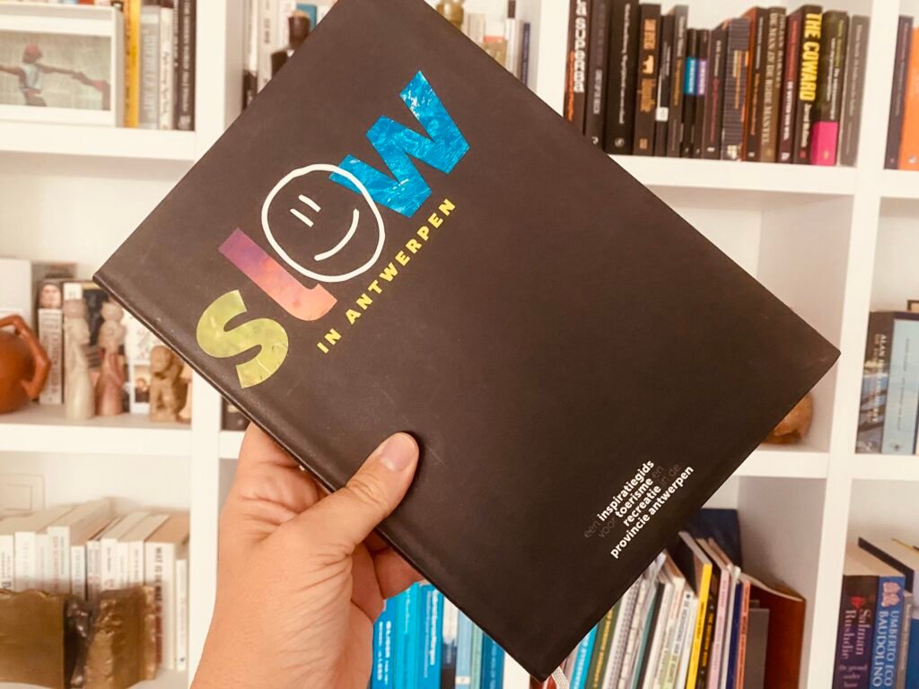
Book
Year
2012
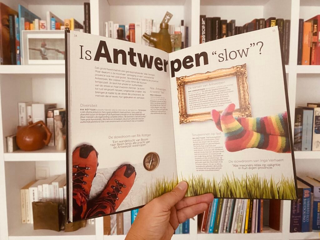
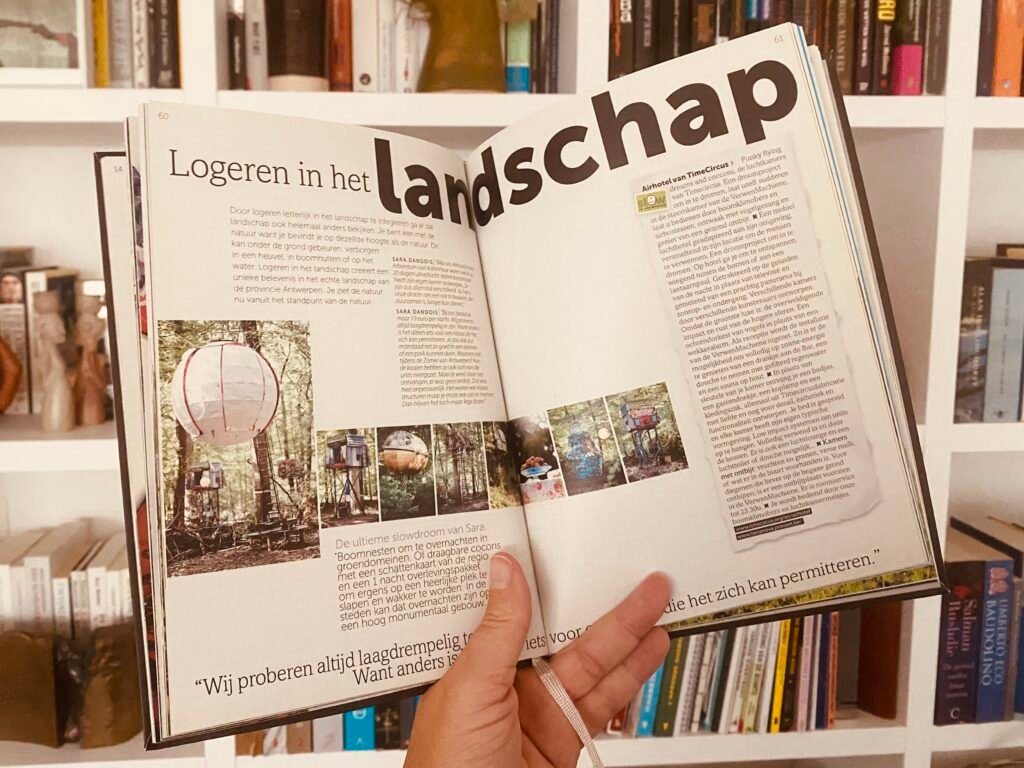
Slow is the result of a series of workshops on slow tourism in the province of Antwerp, Belgium, involving policymakers, nature organizations, event organizers, park and estate managers, tourism entrepreneurs, and others. Across multiple sessions, participants reflected deeply on the province as a whole and explored how slowing down can become a true strength. The core idea is that slowing down improves both life and environment, it is not only about moving more slowly, but about living more authentically. The project takes shape as a book on slow food, slow culture, slow cities, slow fashion, slow travel, and slow tourism.