Dwars

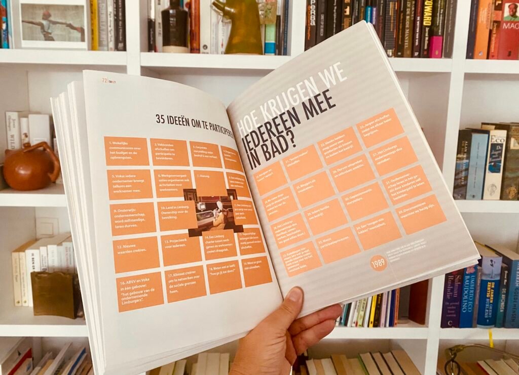
Dwars was initiated in 2010, when we brought together fifteen Limburg entrepreneurs and socially engaged Limburgers at the Chamber of Commerce to collaborate on the future of the province and to articulate new ideas and untapped potential. The project was built on the belief that progress requires independent, contrarian thinkers willing to challenge conventional paths. An unpredictable future, after all, calls for the ideas of people who themselves are not predictable. The result is a beautifully crafted book filled with fresh perspectives on new services, alternative ways of working, and innovative, sustainable projects.

Check more

The Architecture of the Logo

‘’Redaction ■■■■■■ is an intervention into the textual surface of the present, ■■■ one which makes the contours and logics of this surface more legible. Its aesthetics of forgery and détournement, of re-appropriation and re-performance, produce a uniquely direct and ■■■■■■ effect ’’   Andy Zuliani

The Publishing Power of Place logo draws on the act of redaction as both a graphic language and a spatial metaphor. The blacked-out letters reference redaction as an intentional intervention on the page—an act that conceals while simultaneously drawing attention, shaping meaning through absence as much as presence. Rendered in a marker-like style, the logo suggests collective authorship and co-redaction, evoking community input, informality, and an ongoing process rather than a fixed, finished identity. This approach parallels the co-design of space and place, where existing conditions are intervened upon, rearranged, and reinterpreted rather than erased, allowing new possibilities to emerge over time. Like spatial practice, the logo embraces incompleteness and adaptability, positioning publishing as a living process, something continually revised, built upon, and shaped by those who engage with it. Omar Wanas