Client
Own Initiated project curated jointly with Sally Mlingi
Services
- Concept development
- Curatorial narrative design
- Editorial strategy & mapping
- Participatory storytelling
- Living archive design
Year
2025
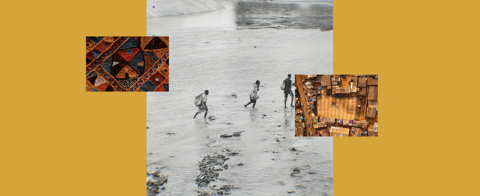
Tapestry of Response is a living, evolving initiative that traces stories of resilience, recovery, and collective imagination across African cities and territories. Rather than framing emergencies solely as sudden ruptures, this project sees them as openings, moments that reveal deep inequalities, but also spark communal creativity, solidarity, and care.
At its core, Tapestry of Response reframes crisis not as an isolated event to be contained, but as a lens through which we can learn how cities are lived, contested, endured, and transformed. It invites urban practitioners, artists, researchers, and community actors to contribute narrative threads, personal stories, artistic expressions, and collective responses, that foreground the human experience of emergency and adaptation.
Rather than a conventional archive, the project functions as a shared cultural weave: a place where voices from the frontline of protests, floods, fires, displacement, and everyday survival converge to offer new understandings of urban life under stress. By combining mapped contributions, interviews, artworks, and testimonies, the initiative creates a tapestry not of abstraction, but of lived realities and shared knowledge.
Through its threads of dialogue, Tapestry of Response encourages cross-disciplinary exchange and collective reflection: between people working in neighbourhoods and those thinking from institutional vantage points; between lived narrative and policy frames; between hope and critique. It embodies the belief that resilience is political, creativity is a form of resistance, and stories, when shared, can become a foundation for compassionate urban futures.