Client
Own Initiated project in partnership with French Institute of Lebanon – Art et Territoire Programme
In partnership with Tyre Municipality, Directorate of Antiquities, and local organizations
Services
- Participatory placemaking
- Curatorial concept & narrative design
- Community co-design & co-build workshops
- Heritage interpretation
- Public art installations
- Cultural programming
Year
2022
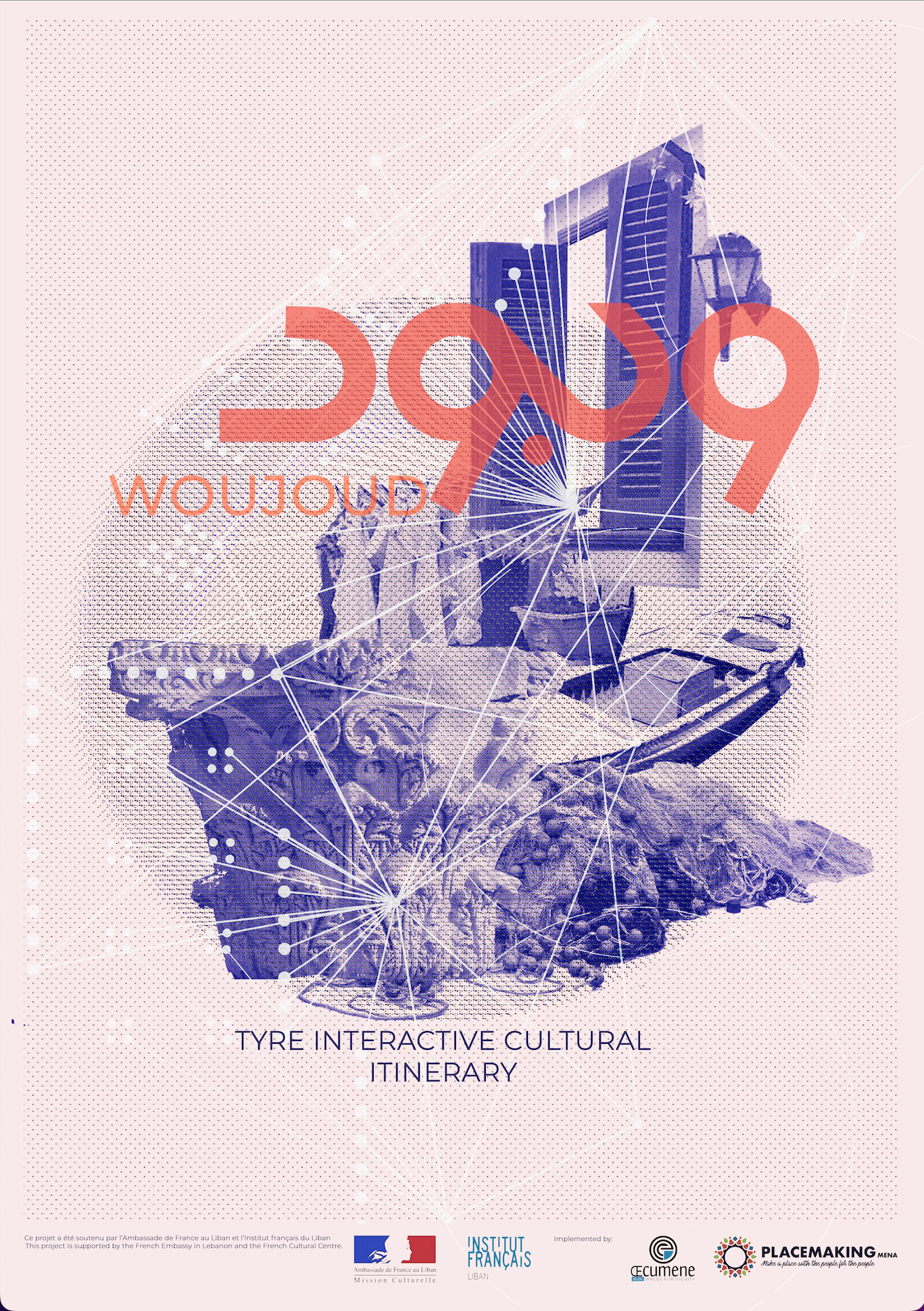
Woujoud — meaning “presence” is a community-based heritage placemaking project developed in the city of Tyre, Lebanon. The initiative sought to reconnect the archaeological site of Al Mina (El Madina) with its surrounding neighbourhoods, weaving together past and present through art, storytelling, and collective action.
Rather than treating heritage as a frozen monument, Woujoud approached it as a living landscape, shaped by memories, everyday practices, and the voices of local residents. Through a participatory process, the project transformed a fragmented archaeological zone into an interactive cultural itinerary, accessible to citizens, visitors, and future generations.
Artists, youth, residents, and institutions collaboratively co-designed and co-built a series of artistic interventions that “stitched” the archaeological site to the urban fabric. These interventions invited people to walk, listen, imagine, and engage, activating forgotten routes and revealing hidden narratives embedded in the city.
The itinerary combined physical installations with digital storytelling, allowing visitors to encounter Tyre not only through ruins, but through lived histories, emotions, and community knowledge. In doing so, Woujoud reframed heritage as a shared responsibility and a collective right, one rooted in participation, care, and continuity.
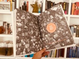
Check this publication about Woujoud :